
University Catholique of Lille
Reduce 90% of the email exchanges between professors and the administration
Mission
As the project product designer, my mission was to led the project to create the better user experience and interface. Through collaborative efforts, we identified of we can improve administration and teachers life. Leveraging user research and insights, I conceptualised and led the development of responsive user interfaces and prototypes, overseeing the project's visual direction to ensure a cohesive experience.
Team structure
2 Product designer (including me)
Research methods
Interview, Focus group, Competitor analysis, user testing
My role
Product Designer, visual design, Facilitator
Plateform
Web app (Desktop)
Time Frame
Complete in 3 months 2023-2024
Design tools
Figma, Paper, Whimsical
UX research
Product design
High fidelity
Advance prototype
Qualitative research
Overview
The client came to us with a specifications document outlining their needs. This document was divided into several stages to first produce an initial usable version. This version was then revisited and refined to make it even more realistic.
Objectives
Identify the needs of the specifications and users to optimize the experience.
Reduce over 90% of email exchanges between professors and school administration.
Achieve a 60% stakeholder adoption rate in the first year.
Strategic Value
01
Address user expectations while respecting technical and organizational constraints.
Aligning user and business needs
02
Centralize and optimize administrative processes to save time and reduce human errors.
Workflow simplification
03
Design a modular platform capable of integrating additional features in the future.
Scalable solution

Outcomes
01
Reduced 90% of administrative email exchanges upon implementing the platform.
Immediate impact
02
Simplified forms and automated frequent tasks.
Increased efficiency
03
Positive initial feedback with a goal of 60% active usage within 12 months.
Targeted adoption
Results


The challenge
From the start, several major challenges emerged. These shaped the strategy and decisions made throughout the project.
01
The first prototype included overly advanced features, making development complex and time consuming. We had to reduce the scope to focus on a clear MVP centered on key functionalities.
Overly ambitious initial scope
02
The platform needed to be intuitive and designed to minimize common errors (e.g., lost information or duplicated tasks). These specific needs emerged during user testing.
Inexperienced users
03
The platform had to integrate with the university’s existing API, developed by a third-party company, which added technical constraints.
Complex technical integration

Exemple of a change
Before —> After
Research
To ensure a user-centered approach, multiple research methods were employed, focusing on collaboration with stakeholders and end-users.
Workshop 1: Understanding the Brief
Challenge initial expectations and clarify business and user needs.
Objective
Collaborative workshop with stakeholders to explore the brief.
Method
Discovery of additional expectations, including specific workflows not mentioned in the brief.
Outcome

Workshop 2: User Interviews
Explore the constraints and expectations of future users (professors and administrators).
Objective
Semi-structured interviews with 4 participants.
Method
Identification of frustrations related to current tools and essential needs.
Outcome

Workshop 3: Ideation and Co-Creation
Generate ideas and structure priorities for the design.
Objective
Collaborative workshop with users to lay the foundation for the prototype. Method Six to One.
Method
A structured list of key ideas for prototype development.
Outcome
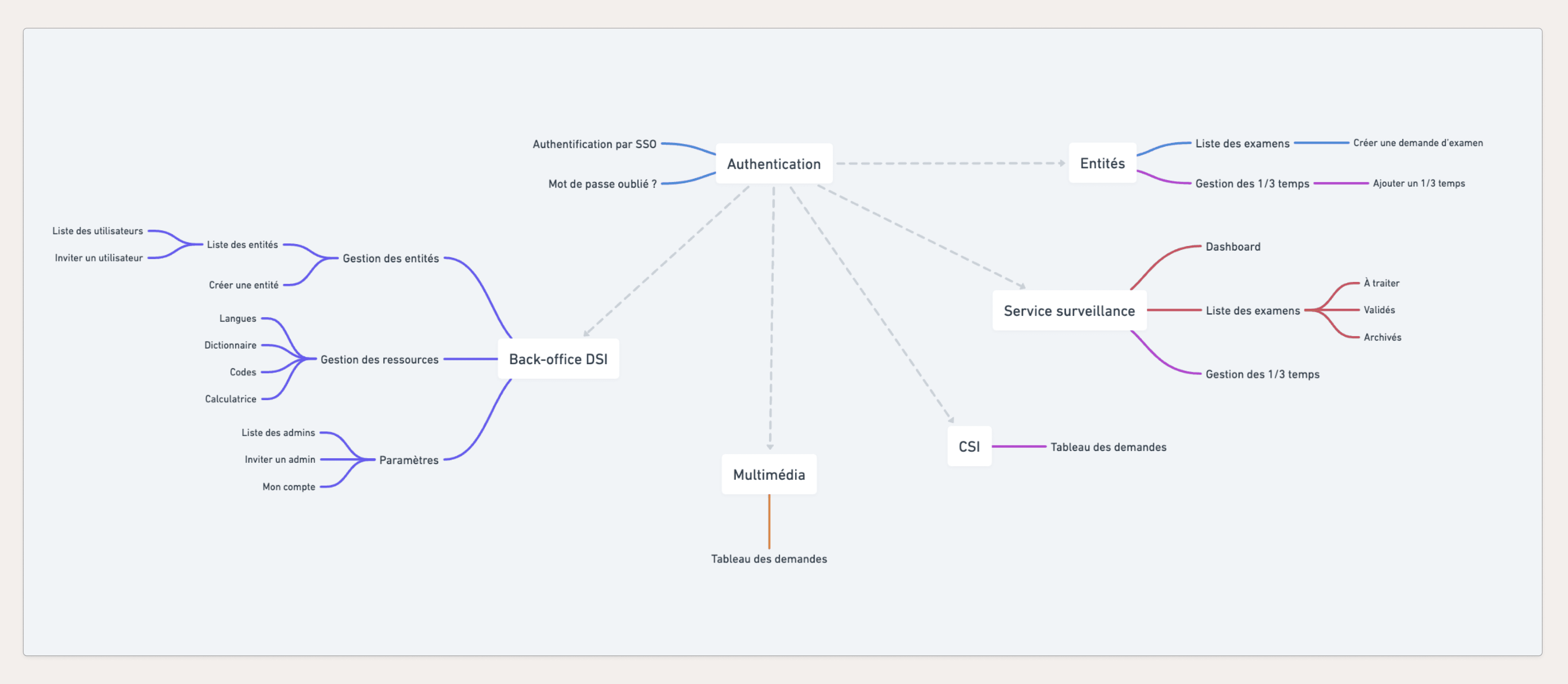
Insights & Results
Through research, several key insights emerged, guiding the recommendations and solution design.
Insights
Challenge initial expectations and clarify business and user needs.
Cognitive overload
Insight :
Limit choices and provide guided workflows.
Data duplication and information loss were recurring problems.
Error frustrations
Insight :
Incorporate auto-save mechanisms and error alerts.
Skill levels varied significantly among users.
Diverse user base
Insight :
Design an interface suitable for novice users while retaining advanced features for experienced ones.
Recommendations
Prioritize essential functionalities and exclude marginal use cases for the first version.

Automate repetitive tasks to reduce human error.

Conduct rapid iterations based on user feedback.

Testimonials
“The new platform is simple and efficient. We’ve drastically reduced unnecessary exchanges, saving us a lot of time.”
-University Professor-
“We finally have a tool that meets our real needs, not just what was outlined in the initial brief.”
-Administrator participating in the workshops-
My learnings
This project offered several valuable lessons, both methodological and human.
Re-challenging initial requirements is key
01
This project emphasized the importance of questioning initial requirements. User research revealed significant gaps between the client’s brief and real user needs. By involving users early through interviews and workshops, we refined the scope and delivered a solution that truly aligned with their expectations. This experience solidified my belief in the value of validating assumptions at the start of any project.
Simplicity enables efficiency
02
Initially, our design was too complex, which delayed development. Reducing the scope to a focused MVP allowed us to prioritize key features and address core needs efficiently. This taught me that starting small and iterating based on feedback often results in faster delivery and higher user satisfaction.
Collaboration drives success
03
Close collaboration with developers, stakeholders, and users was critical to the project’s success. Regular communication helped bridge gaps between technical feasibility and user expectations, fostering a shared vision. I learned that creating space for diverse input strengthens both the process and the outcome.
User error prevention enhances satisfaction
04
Testing revealed that users often made simple errors, such as misclicks or overwriting data. Adding features like autosave and error alerts significantly improved their experience. This taught me that anticipating and mitigating user mistakes is key to building trust and satisfaction.
Early testing saves time
05
Limited late-stage testing highlighted issues that could have been caught earlier. This showed me the value of integrating usability testing during the wireframe phase to identify and resolve problems sooner, saving time in later iterations.