Summary
Context
A client owning an entrepreneurship-focused blog aspired to create an educational platform for aspiring business founders. He envisioned merging his existing blog with the new platform, creating a bridge between blog articles and interactive educational resources.
Team & Role
Co-facilitated workshops with my manager
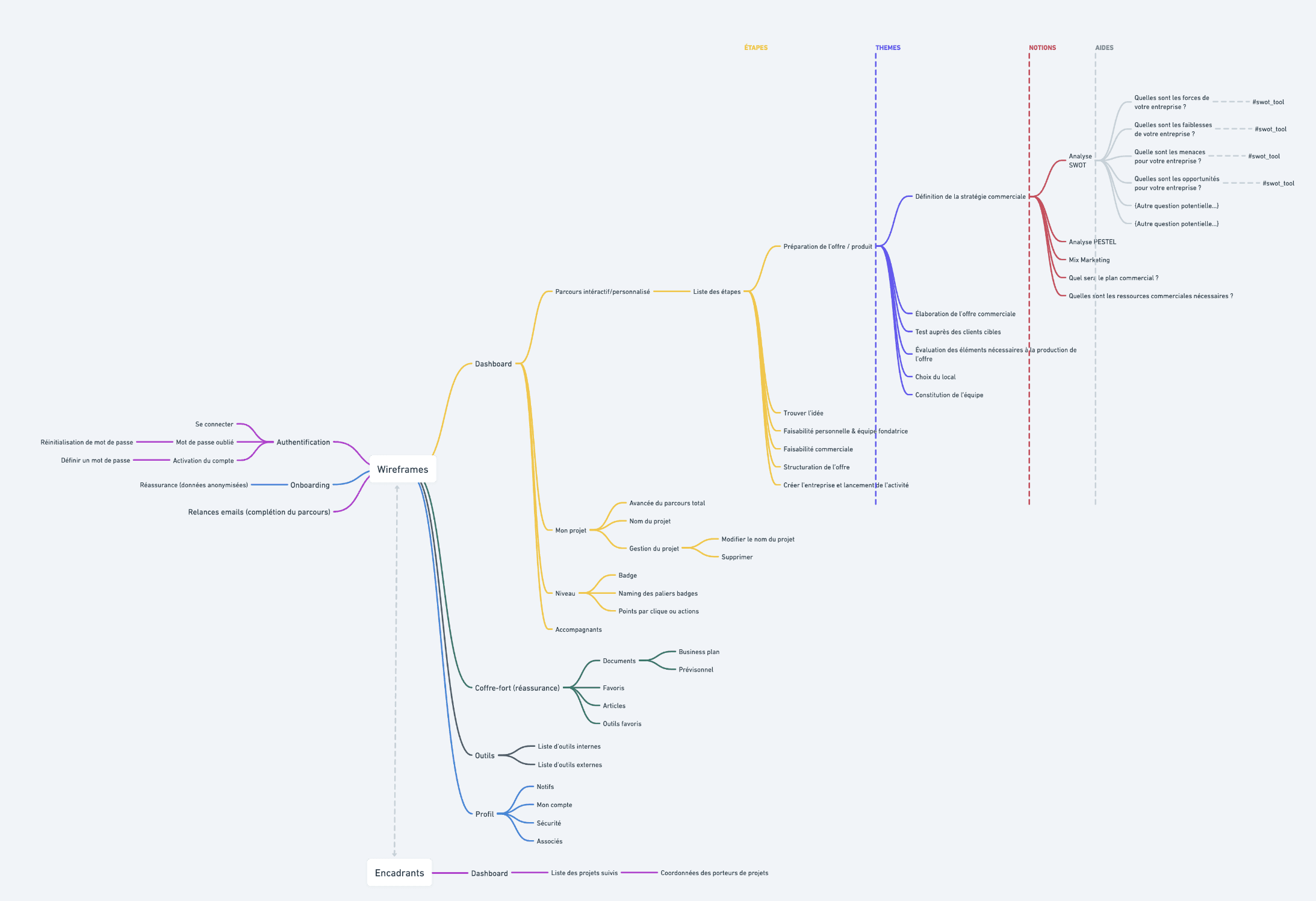
Led the creation of the platform (wireframes, site architecture, prototype)
Directed user testing
Timeline
The project began a few months ago before being put on hold. After a period of interruption, it was relaunched with necessary adjustments due to budget prioritization.
Constraints
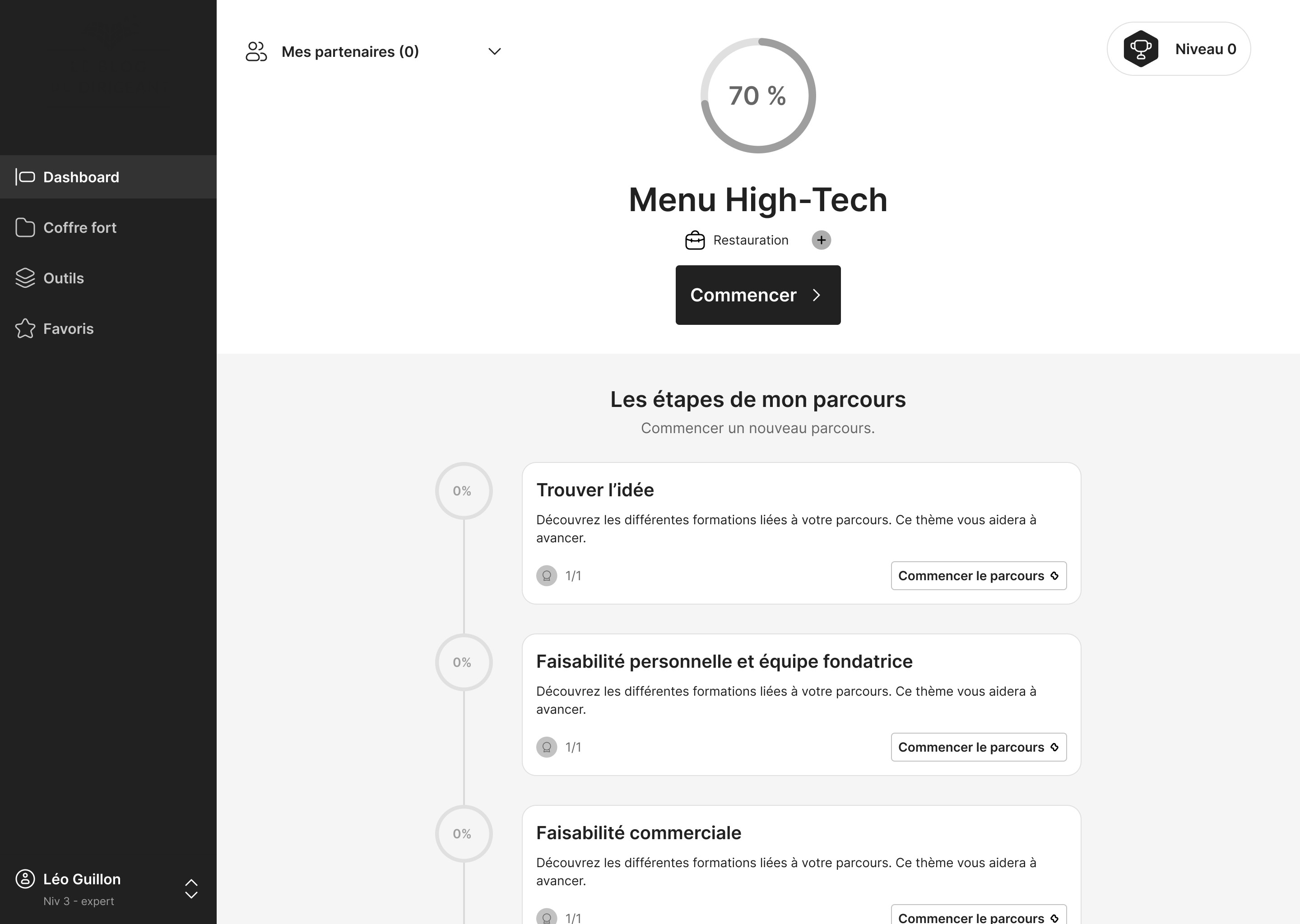
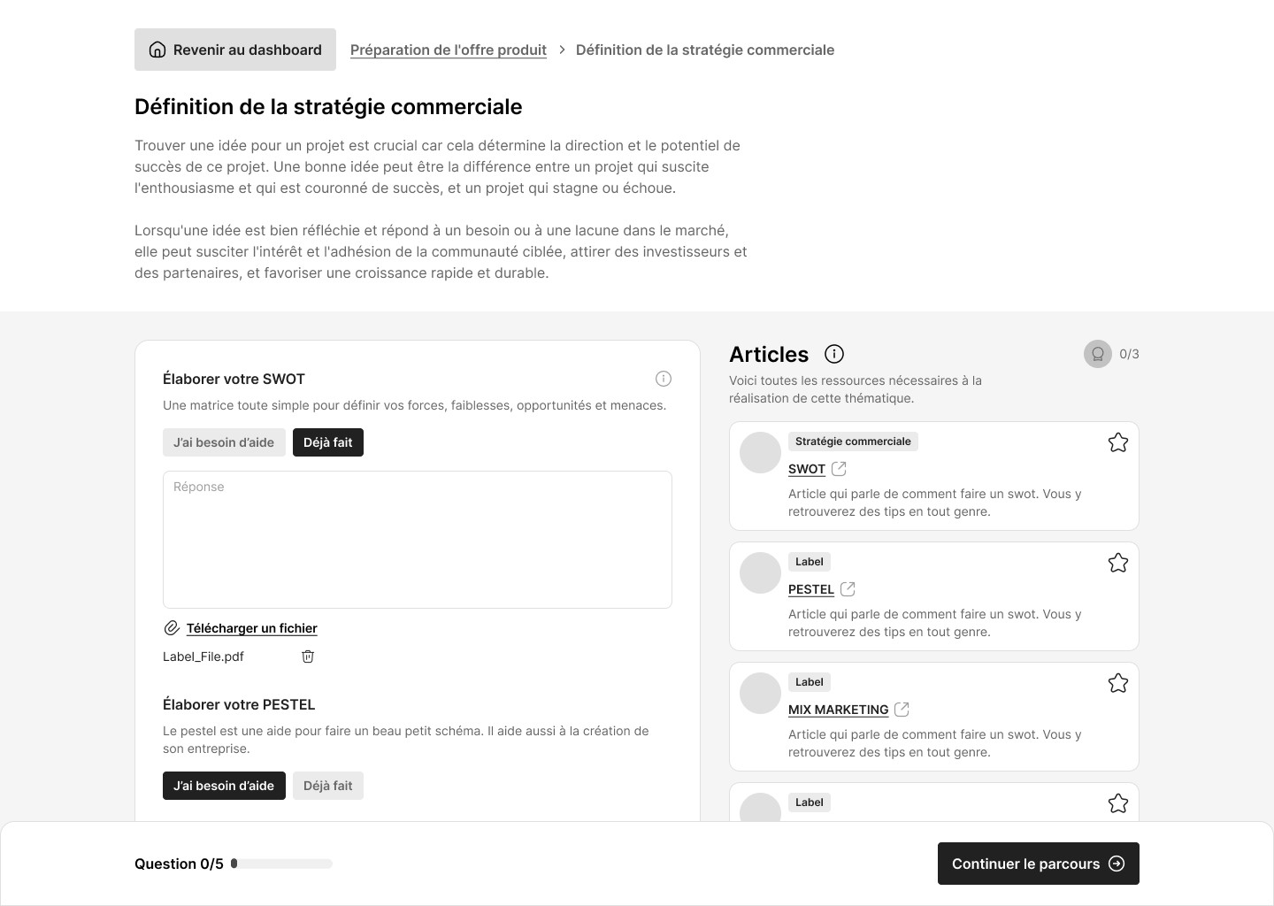
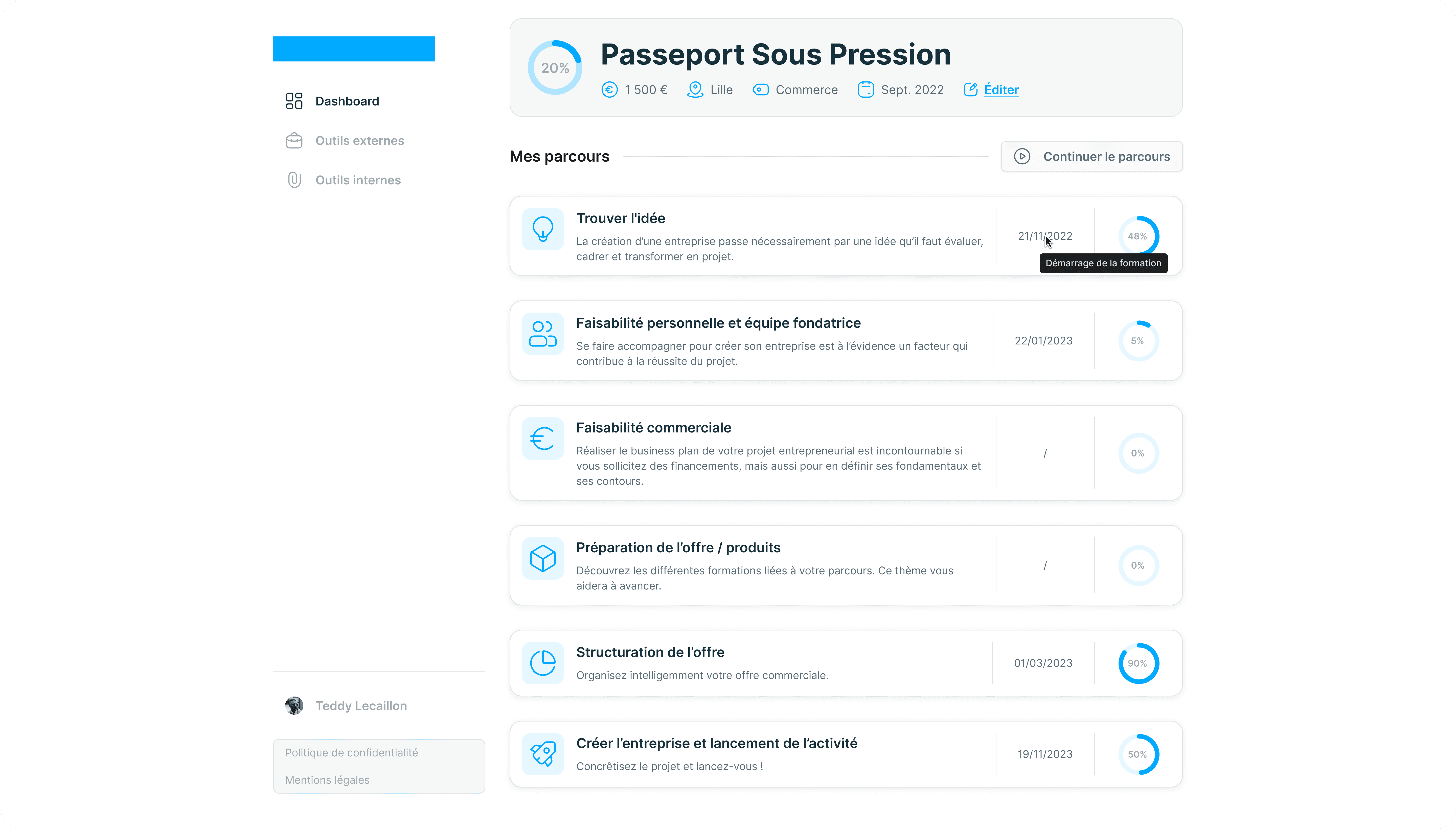
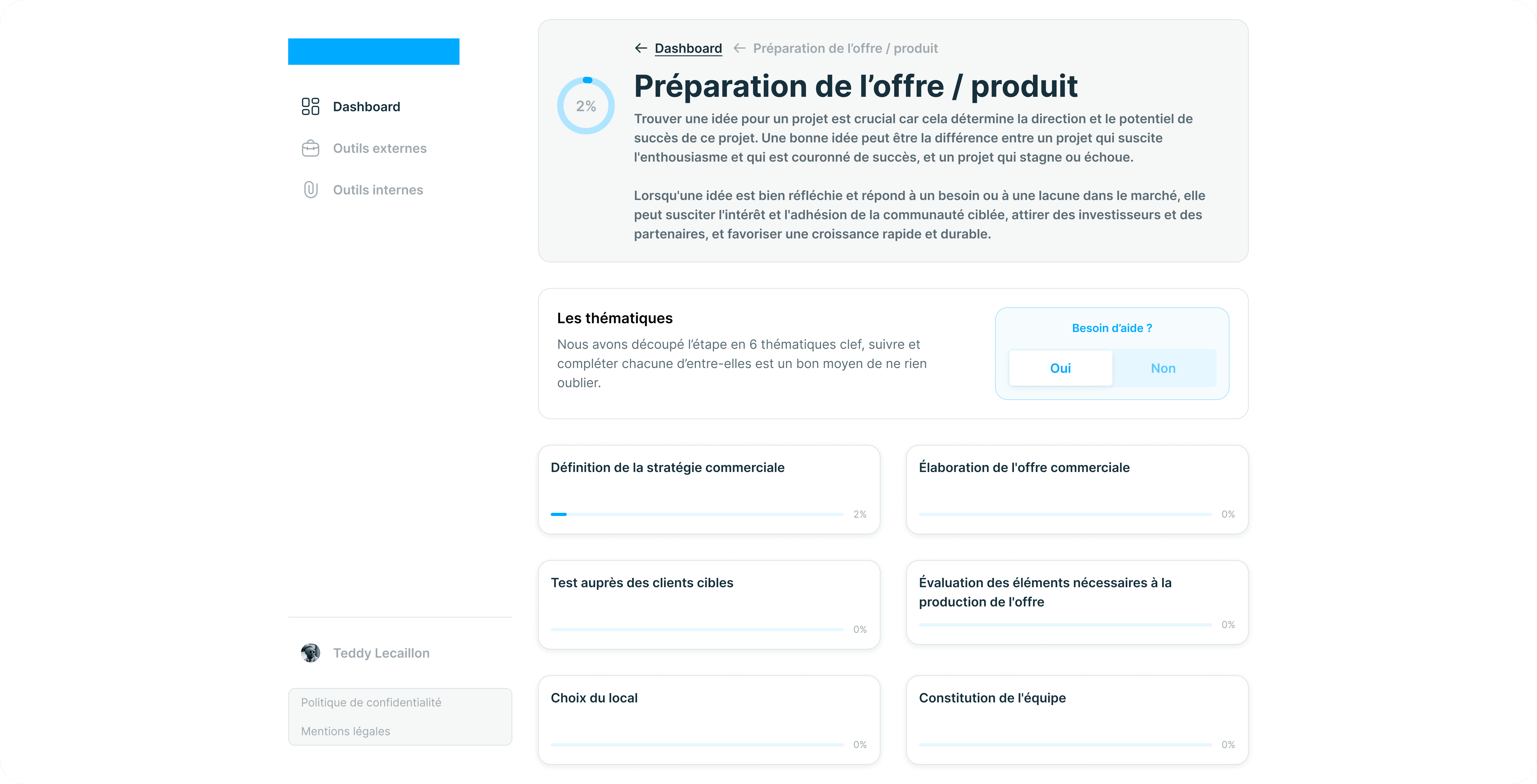
The project unfolded in two phases. Upon resumption, budget constraints were introduced, influencing the project's progress and design choices (see the second mockup visualization at the end of the project).
Processus
Understand – Lean Business Canvas + client interviews
Diverge – Proposed various ideas using the “Product Design Sprint” method
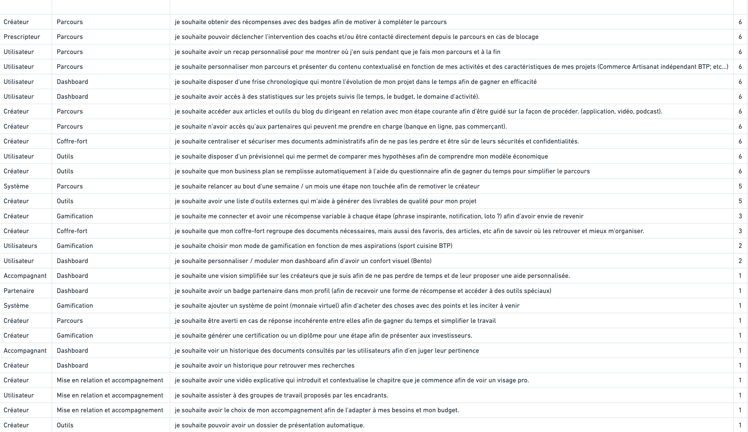
Converge – Prioritized the ideas generated in the previous phase and voted
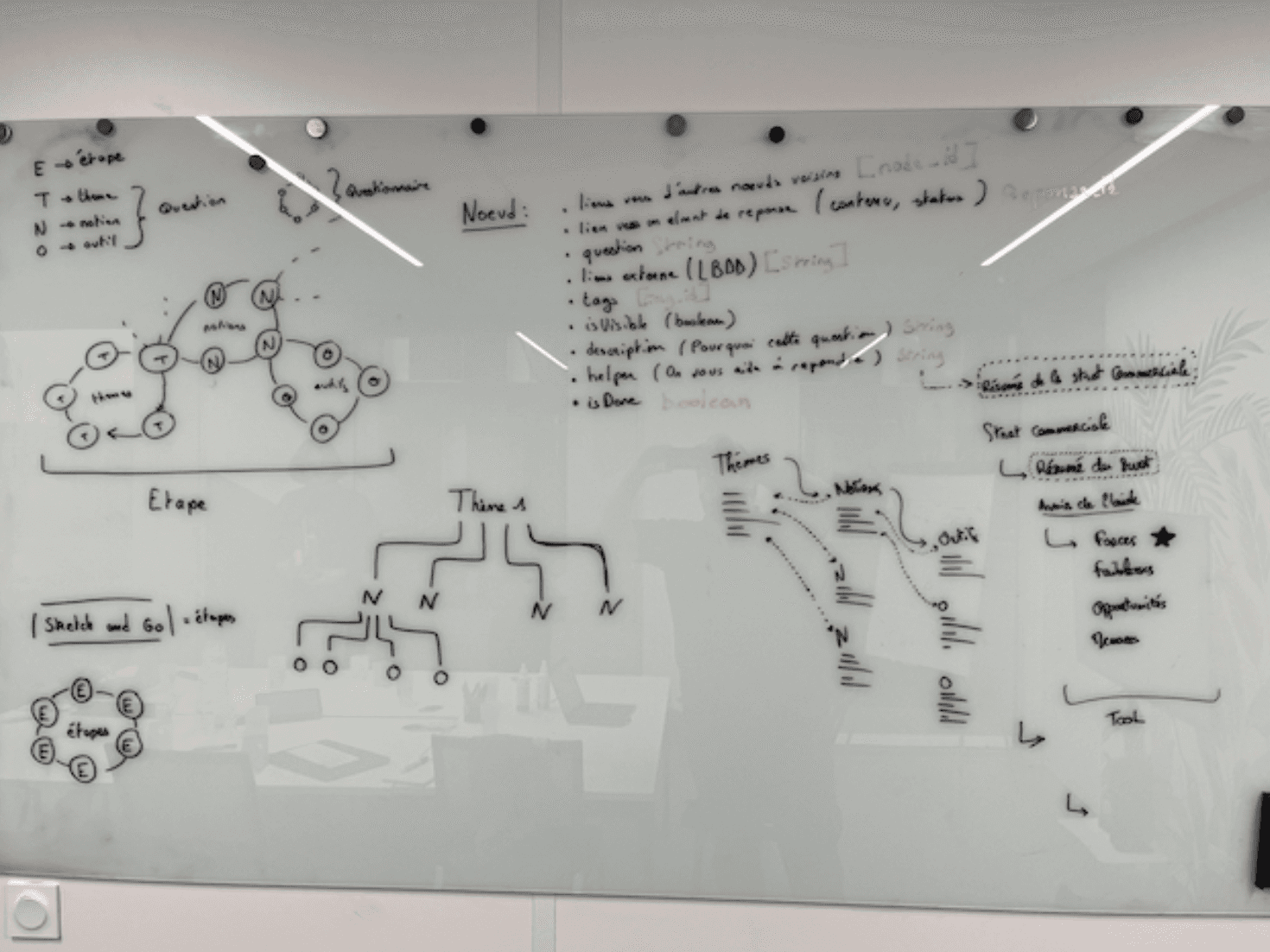
Prototype – Sketching, high-fidelity wireframes & prototyping
Test – Conducted testing with a panel of users
Discovery phase
Understanding User Needs
The client provided valuable data showing a growing need for support in the entrepreneurial world. This data, gathered from interviews conducted by the client, highlighted an emerging demand for such a platform.
Competitive analysis
An in-depth market study was conducted. The few existing competitors were either incomplete or lacked advanced personalization.
Integration of blog content
To enrich the user experience, the client's blog content was integrated from the initial phase. It served as a foundation for defining user needs and expectations.
Ideation phase
Workshop structure
First Workshop: Focused on divergence, aiming to quickly generate group ideas.
Second Workshop: Focused on convergence, prioritizing generated ideas using a dot-voting system to evaluate feature interest among participants.
Challenges
One of the major challenges was managing group dynamics. Participants' frustration was palpable, especially when faced with a limited number of possible options for their application.
Priorization
Through the convergence phase, the generated ideas were sorted and prioritized, allowing the team to focus on the most relevant ones while setting others aside.
Prototyping, Design & Testing Phase
Tools
Figma: Preferred tool for prototyping and testing
Whimsical: Used for site architecture, business plan canvas, etc.
Notion: For note-taking and information gathering
User interface decisions
The interface was designed based on the team's collective experience, benchmarks, and preliminary sketches. Once the foundations were established, work on Figma began to produce a high-fidelity prototype.
User testing
After completing the high-fidelity design phase, tests were conducted with seven users. This allowed significant improvements to the platform by incorporating precise user feedback.
Challenges and constraints
Upon resuming the project, adjustments were necessary. The key was to consider every piece of user test feedback while advising the client and relying on tangible data to support decisions.
